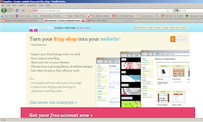
I hadn't heard of SoopSee until this week when I joined, but it's a very interesting resource for artisans. Currently they only support Etsy, but essentially the site links your shop, blog, and twitter all on one webpage.
Basic accounts are free and you are able to customize your page based on several different layouts. This is what my page looked like at first when I signed in and viewed it:
As you may have noticed if you clicked on the image to zoom in, there was a notice at the top of my page about Pro accounts. Apparently I wasn't too adept at understanding the difference between Pro and Basic accounts. To me, SoopSee's one flaw is it's current lack of available layouts. If you want more than a very simplistic web design, you need to be a Pro member.
Currently the Basic layouts are just too basic for me. My advice to anyone trying out SoopSee at a basic level is to make sure that you select a non-Pro layout - the system will not prevent you from selecting the wrong type on your own. Let me show you what I mean. This is what my SoopSee page looks like with the "Green Ribbon" layout in my browser when I'm not signed in:
Gross, right? This is the Basic black and white theme entitled "Simple" and it doesn't match my brand image at all! So this is my one criticism: I have no problems paying for advanced features, including special layouts, but I feel like the site would have much more value to Basic users if they were able to have more control over the look and feel of their site. The good news? I fully expect this to occur in the future as SoopSee promises on the layout selection page that they will be uploading more layouts than the 2 Pro and 6 Basic that are currently available. I would not want to discourage anyone from trying a Basic account based on the lack of available themes since there are additional ones in the works.
I changed my site's theme today to "Rustic White," which is a plain but much better look for my site than "Simple":
Let's move on from the layout issue. Now my favorite SoopSee feature has to be the statistics. You're able to see who has "hearted" your Etsy shop and when as well as monitor your views. The stats page even tells you how much your shop is worth based on the prices of the items you've listed:
I don't currently use another site for monitoring statistics so I will likely maintain my SoopSee account whether or not I go and stay Pro in order to keep this feature. It is available with any Basic account.
Advanced features for Pro members on SoopSee are pretty extensive. You're able to add multiple Etsy accounts and blogs, set your SoopSee site to your domain name URL, download your SoopSee site for editing and hosting with another service (which will let you edit your CSS/HTML code and make the site match with your branding much better than if you use a layout), and more:
I still haven't decided whether or not it's worth it for me personally to pay for the SoopSee Pro account since I only have one blog and one Etsy shop, but if you're seriously considering a subscription I encourage you go ahead and sign up now. Once the site leaves "Beta" testing the Pro fees will jump from a locked-in price of $5 per month to the much steeper price of $15 per month. Perhaps when they add Artfire, 1000 Markets, Zibbet and other popular artisan marketplaces (which I was told by SoopSee staff via twitter is an additional feature currently in the works) the service will be worth $15 per month to you - but there's no sense in waiting if you think you'll utilize the Pro features since the monthly fee can be locked in at a 66% discount.
Do you use SoopSee? Put your site URL in the comments so other readers can visit you and evaluate whether or not the site is right for them! Are there reasons you don't use the service? Be sure to let us know that as well!
Until next time,
Elle
Find me on SoopSee: http://www.soopsee.com/profile/ellesbeads


0 comments:
Post a Comment